Let’s play pretend for a minute. Imagine you’re at a popular new restaurant after hearing rave reviews. You walk in hungry, excited, and ready to try something new, but as soon as you get to your table, you realize the menu is printed in a font so tiny you can barely read it. Or maybe the names of the dishes are written in a language you don’t understand, or the waiter rushes through the specials without slowing down for questions. The food smells great, but ordering feels impossible. Frustrating, right?
What Happens When Websites Aren’t Accessible
That’s pretty much how it feels for so many people when they land on a website that isn’t built for everyone. Just as you’d never expect someone in a wheelchair to walk up steps to get into your store, we should be just as considerate when it comes to making our online storefronts accessible to everyone.
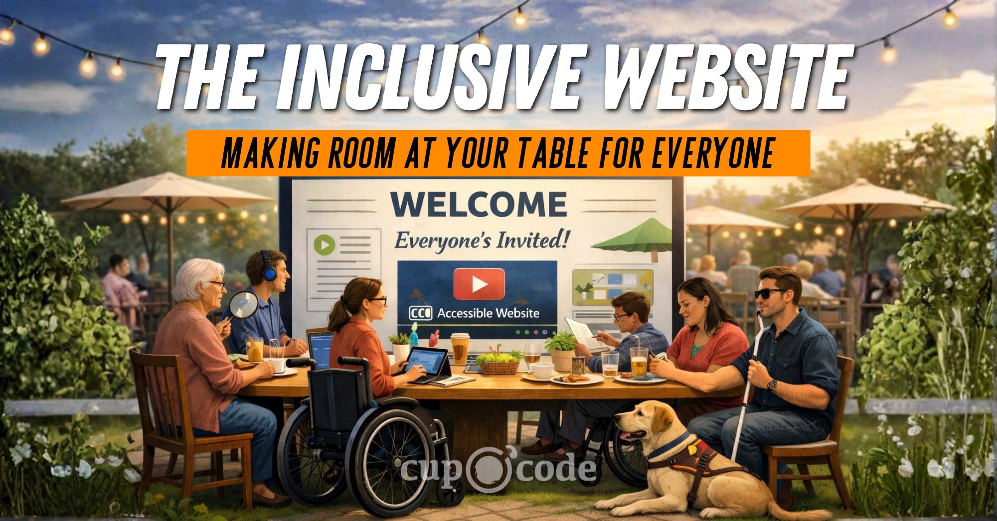
When it comes to your website, you want to be the kind of host who makes sure there’s plenty of room at your table for everyone who stops by, no matter what they need to feel comfortable and included. So, let’s dig into web accessibility together, not as a tedious to-do but as a genuine act of welcoming every guest. Pull up a chair. Everyone’s invited.
A Quick Word on the Legal Side
It’s not just good manners and good business to make your website inclusive. There are real legal responsibilities, too. In the United States, the Americans with Disabilities Act (ADA) prohibits discrimination based on disability. Courts have made it clear: this applies to websites as well as physical locations. In recent years, businesses have faced thousands of lawsuits over inaccessible websites, and no one gets a pass just because they didn’t know better. Making your site accessible can help you avoid costly legal trouble and position your business as one that truly welcomes everyone. For a deeper dive into what the ADA requires, check out the ADA’s overview on ADA.gov and this government summary of web accessibility requirements. It’s a simple way to show compliance, protect your reputation, and give a better experience to every visitor.
What is Web Accessibility, Really?
When we talk about web accessibility, we’re thinking about all the different ways people might interact with your site. Consider these types of disabilities:
- Visual impairments (blindness, low vision, color blindness)
- Hearing impairments (deafness, partial hearing loss)
- Mobility or physical disabilities (trouble using a mouse, limited dexterity)
- Cognitive disabilities (learning differences, memory challenges, attention difficulties)
- Neurological conditions (like epilepsy or migraines triggered by visuals)
- Speech impairments (difficulties with voice navigation or input)
Web accessibility is really about making sure everyone can actually use your website, no matter how they get around online. Some need a screen reader to hear what’s on the page. Others can’t grip a mouse and rely on a keyboard. Our goal is a website that’s inclusive, simple to use and welcoming, no matter a visitor’s abilities.
It’s tempting to think accessibility is just for someone else, but honestly, it’s helpful for all of us. Ever tried watching a video with toddlers running around and turned on captions? That’s accessibility in action. Or maybe you’ve pinched and zoomed your phone screen to read the tiny menu at your favorite restaurant’s site… Can I get an amen from all my over 40-year-olds? Yep, that’s accessibility, too. When we make our websites more usable for everybody, we’re not just being nice. We’re building spaces that welcome more visitors and grow along with us.
It’s Not About Numbers, It’s About People
It’s easy to get caught up in numbers like clicks and page views, but every single one of those numbers is a real person showing up on your site. When you make your website more accessible, you’re letting people know they’re seen and that you want them to feel at home. It’s your way of saying, “Hey, you matter to us and we want your experience here to be a good one.”
Think about how it feels to pop into your favorite little shop and be greeted by someone who actually looks you in the eye and smiles. That’s the vibe we want for our websites, too. When your site is built to include everyone, it shows you care, like truly care, about your community and want folks to feel good being there. People remember that! They remember being welcomed and seen, and that kind of connection? It sticks way longer than any clever ad ever could.
Simple Steps to a More Welcoming Website
Making an inclusive website isn’t some big, scary project that takes a tech wizard. It’s really just about trying little things, one at a time. You don’t have to tear everything down and start fresh. Small changes add up, and you can start today. Here are a few practical, doable things you can do to help everyone feel at home on your site.
1. Add Alt Text to Your Images
Think of alt text like a friendly caption for your photos. It’s the quick blurb you write so screen readers can tell people what an image shows. Next time you upload a picture, skip “image1.jpg” and jot down something real, like “A smiling woman with brown hair sits at a desk, typing on a laptop.” It only takes a second, but it helps everyone get what’s going on, even if they can’t see the pic.
2. Make Your Colors Friendly for Everyone
Ever squinted to read pale letters on a bright screen? You’re not the only one. Some folks with low vision or color blindness will have a tough time if your text doesn’t contrast with the background. Play around with different shades and check what works. There are free color check tools online like WebAIM Contrast Checker and Color Contrast Analyzer by TPGi that make it a breeze. Just making sure your words pop can mean the difference between someone sticking around or clicking away.
3. Make Sure Your Site Works with Just a Keyboard
Some folks don’t use a mouse, whether that’s due to a physical challenge or just plain preference. They get around using the tab key, hopping from link to link, button to button. Give it a try yourself! See if you can scroll through your own website, fill out a form, and open pages without ever touching your mouse. If you find yourself stuck or lost, that’s your cue that something needs a little tweak.
4. Use Clear, Down-to-Earth Headings
Think of headings as road signs for your website. They break things up, make big blocks of text way less overwhelming, and help folks (and screen readers) find what they need fast. Put your main idea in a big H1, use H2s and H3s to organize the details underneath, and keep the order simple. It’s like giving everyone a map so nobody gets lost in a wall of words.
The Inclusive Website
Making your website inclusive isn’t something you check off a list and forget about. It’s more like showing up for your friends. You keep learning, tweaking, and looking for ways to do better. Sometimes you have to ask questions or get feedback, and that’s totally okay! You don’t have to know it all or do it solo. Just being open to new ideas and improvements means you’re on the right track. Here at Cup O Code, we really believe the internet should be welcoming for everybody. When we build websites, we want them to look great and actually feel friendly to anyone who shows up. And if you’re reading all this and thinking, “Whoa, I don’t even know where to start,” it’s okay. We get it. You don’t have to figure it out alone. Take the first step with an accessibility audit to ensure your website is compliant and user-friendly. If you’d like more step-by-step help, give us a call. We’ll map out a plan to make sure your little corner of the internet is a place where every guest feels right at home.